

In this post we’re going to take a journey into the world of power-law distributions. Power laws pop up again and again in my research. But I’ve never taken the time to discuss what makes them so weird. This post will be a little ‘power-law primer’ that I’ll reference in future blog posts.
Let’s start by defining the word distribution. A ‘distribution’ refers to how data is spread out. I’ll use human height as an example. Suppose we have data on the heights of many different individuals. Within this data, we can analyze the frequency of different heights. This frequency quantifies the ‘distribution’ of human height.
Histograms are the main way we visualize distributions. Histograms plot frequency against size. To make a histogram, we divide the data into a series of ‘bins’. For height, this might be 5cm intervals (i.e. 160-165cm, 165-170cm, etc.). Then we count the frequency of the data within each bin, and plot the result. The shape of the histogram allows us to visualize the distribution of height.
The figure below shows histograms of male and female height in a sample of Americans. (OK, technically these plots are ‘frequency polygons’, but the distinction is not important here).

This figure was created to highlight the overlap of male and female characteristics. But here I’m concerned only with the shape of the distribution. Notice how the histograms look like a bell? This bell-curve shape is so common that statisticians have a special name for it. Being terribly imaginative, statisticians call it the normal distribution.
The important feature of the normal distribution is that values cluster around the average. In the figure above, the average male height is 174cm and the average female height is 161cm. By visual inspection, we can tell that most males and females are within 10cm of the respective average height of their sex. This clustering around the average is what gives the normal distribution its characteristic bell-curve shape.
This clustering is also what makes the normal distribution intuitive to most people. Why? Likely because human characteristics cluster around a small range of values, and these are the things we’re most familiar with. Think of any human characteristic — height, weight, intelligence, running speed, jumping ability, etc. For any given characteristic, most people will be close to average, clumped in the body of the bell curve. True, we can always find exceptional people. But there are strict limits to human exceptionalism. We will never find a person who is 20 meters tall. Nor will we find someone who can jump 50 meters high. In the larger scheme of things, variation in human characteristics is small.
But while human characteristics show a clumping behaviour, not everything does. Some things have no characteristic scale. They vary wildly in size, often by many orders of magnitude. Instead of following a normal distribution, these things follow a power-law distribution. A power law is named after the equation that describes it. In a power law, the probability of finding something of size x is proportional to x raised to some power: p(x) \propto x^{-\alpha} .
Unlike the normal distribution, power-laws are unintuitive to the human mind. My goal here is give you some intuition about power laws by visualizing some of their properties.
What if human height followed a power-law distribution?
To get a sense for power laws, let’s do a thought experiment. Imagine that human height is distributed according to a power law. We’ll compare this imaginary distribution to the actual (normal) distribution of height. Here’s what it would look like:
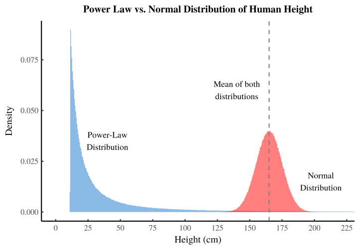
Here the blue area shows our (imaginary) power-law distribution of human height. The red area shows the actual (normal) distribution of human height. Both distributions have the same average (mean) height. Notice that the vertical axis is labelled ‘density’. You can continue to think of this as relative frequency — the proportion of people with the given height. The term ‘density’ just means that we have adjusted the y-axis so that the area under the histogram sums to one.
What do you notice about the power-law distribution of height? The first thing I notice is that most people are incredibly short. About 75% of people are under 25cm tall! This imaginary world is populated by people the size of pygmy marmosets, the world’s smallest monkey. Some people are even smaller — a few centimetres tall, the size of large insects. But while most people are incredibly small, the average height in this imaginary world is the same as in the average height in the real-world. How can this be?
This is the unintuitive part of power-law distributions. Our imaginary world is populated mostly with tiny individuals. But the average height is larger than we expect. This is because our power-law distribution contains a few preposterously large individuals. Some people are as tall as trees. But height doesn’t stop there. In our imaginary world, some people grow as tall as Mount Everest. These monsters are extremely rare, but they are so large that they pull up the average.
Now, this thought experiment is obviously preposterous. Humans never get as tall as mountains, nor do we get as small as insects. But this nicely illustrates the extremes of power-law distributions. Power laws are very different than the familiar normal distribution. In a normal distribution, extreme outliers are essentially forbidden. We will never find a human as tall as an elephant, let alone Mount Everest. In statistical terms, this means that the ‘tail’ of the normal distribution dies off quickly. This ‘thin’ tail forbids extremely large observations.
But unlike the normal distribution, a power law has a ‘fat’ tail that dies off slowly. This fat tail permits extremely large observations to occur. While rare, these observations can be so large that they still raise the average. The result is that the mean of a power law is nowhere near the bulk of the distribution.
In our imaginary world, more than 90% of people are ‘below-average’ height! This sounds absurd, but that’s because we’re accustomed to the properties of normal distributions. In the familiar normal distribution, half the population is ‘below average’ and half is ‘above average’. But power laws do not play by these tidy rules.
The power law in full glory
Visualizing power-law distributions on a linear scale doesn’t really do them justice. The problem is that the range of these distributions is so large, it’s hard to capture on a linear scale. In the figure above, we would never guess that our power-law distribution allowed people as tall as Mount Everest. This height (millions of centimetres) is literally off the chart. Linear scales tell us about the body of the distribution. But they tell us nothing about the tail. And in a power law, the tail is important.
To see a power law in full glory, it’s better to look at a logarithmic transformation of the distribution. This transformation converts numbers to powers of 10. Under a log transformation, the numbers 1, 10, 100, and 1000 would become 0, 1, 2, and 3 (respectively). This transformation allows us to look at data that varies enormously in size.
The figure below shows the log transformation of our power-law distribution of human height. We plot the histogram of the logarithm of height. And instead of plotting frequency, we plot the logarithm of frequency. (Here I plot the log of density, which is just an adjusted version of relative frequency).

Now we can see our power-law distribution of height in its full glory. While the normal distribution spans less than an order of magnitude, our power law spans 6 orders of magnitude. Height ranges from 1cm to over 1 million cm (about 10km). In the far right part of the power-law tail, the line gets squiggly. This is because observations become so rare that noise starts to dominate the signal.
In this figure, we can also see the most celebrated feature of a power-law distribution. Under a log-log transformation, a power law becomes a straight line.
The biomass spectrum
Our thought experiment of a power-law distribution of human height was clearly unrealistic. But if we leave the myopia of the human experience, we find that life on earth is filled with power laws. Perhaps the best example is the size distribution of all organisms.
Think of life in all its diversity. It ranges in size from tiny bacteria to massive blue whales. The mass of different organisms spans about 20 orders of magnitude. It turns out that the size (mass) distribution of life follows a power-law. Ecologists call this the biomass spectrum. It’s easiest to measure in the ocean, so we’ll use this as an example. Suppose we pick a patch of ocean and gather up all the life within it. We weigh each organism, and record its mass. Then we look at the proportion of organisms within each range of mass. Here is a visualization of what we might find:

This figure plots the logarithm of size against the logarithm of abundance. According to this illustration, we expect that the size distribution of marine life has a straight line on a log-log transformation. This means it (roughly) follows a power law. When we look at actual data, this is exactly what we find:

This figure shows the biomass spectrum in Lake Superior. The curved lines show the fit to each species. Within each species, the size distribution doesn’t follow a power law. But when all the species are combined we get a power-law distribution. I only recently discovered the biomass spectrum, and I’m still marvelling at its almost magical properties.
I like the biomass spectrum because it illustrates the extremes of power-law distributions. It is useful to think of power laws as composed of different species of individuals. In the biomass spectrum, this is literally true. There are the vast numbers of algae and zooplankton that are tiny in size. Then there are large fish that are enormous by comparison, and also exceedingly rare. These different species coexist in the same distribution. By thinking about different species, we can get an intuitive sense for power-law distributions.
A human example — the size distribution of firms
While human body size is not power-law distributed, many aspects of human social organization obey power laws. We’ll look here at the example of business firms.
Like organisms, business firms can vary over an enormous size range. In effect, there are different species of firm. There are small firms, composed of a few individuals. These are equivalent to algae in our biomass spectrum above. There are midsize firms with dozens of employees, equivalent to zooplankton. Then there are the large firms with thousands of employees. These are the big fish of the firm size distribution. Lastly there are the huge firms like Walmart, with millions of employees. These are the whales of the firm size distribution.
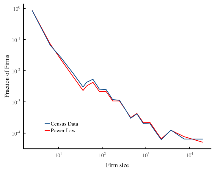
Like the biomass spectrum, the firm size distribution roughly follows a power law. The figure below shows the US size distribution of firms, plotted on log-log scales. The jagged shape of the curve is caused by the differing firm-size bins used in official statistics. I’ve plotted an actual power-law distribution for comparison.
A firm landscape
We’ve now been through two ways of visualizing power-law distributions. First, we looked at the histogram on a linear scale. Second we looked at the histogram on a log-log scale. These histograms are useful for showing the shape of the distribution, but they still don’t give us an intuitive sense for what the distribution ‘looks’ like. What is it like to have whales coexisting with algae in the same distribution?
I’m not going to visualize whales and algae. But I’ve come up with a way of visualizing the different ‘species’ of business firms. I call it a ‘firm landscape’. We visualize firms as pyramids. The size (volume) of the pyramid indicates the number of people within it. For now this is just a pretty way to visualize the size distribution of firms. But in coming posts, I’ll use the same landscape to visualize firm hierarchy.
Let’s begin by imagining that firm size follows a normal distribution. We’ll make the average firm have about 6 members, on par with the average firm size in the United States. Then we’ll add a small amount of dispersion so that 95% of firms have between 2 and 10 members. The figure below visualizes this firm size distribution as a landscape of pyramids:

There are 20,000 firms in this figure. When we look at this landscape, it appears remarkably uniform. It reminds me of a large crowd of people. In fact, this is an apt metaphor, because the variation in firm size is comparable to the variation in human height (if we include children). All of these firms belong to the same species.
Now let’s look at a power-law distribution of firms, similar to what we would find in the United States. Here is what it looks like:

Even though the average firm size is similar to our normal distribution, this landscape looks completely different. It looks like a crowd of people standing amidst the pyramids of Giza. We have a distribution of firms that consists of different species. The vast majority of firms are tiny, having 1 or 2 members. These are the small dots that litter the figure above. Amidst these tiny firms are fewer midsize firms. And then there are the rare large firms — the big fish in the sea.
In this visualization, we never get to whales — the giant firms like Walmart. These giant firms are so rare that to see one, we would need a landscape with millions of firms (the one above has 20,000). I’m too impatient to wait the multiple hours that my computer needs to render this landscape.
Firms and organisms: more than just a metaphor?
I’ve metaphorically compared the firm size distribution to the biomass spectrum — the size distribution of individual organisms. Both are power-law distributions. At first, I thought this was where the similarity ended. But now I think there may be a deeper connection.
In coming posts, I’m going to discuss how the firm size distribution changes with energy use. I’ve recently discovered that the biomass spectrum may also change with energy use in a similar way. I’m still trying to wrap my head around this, but I think there are some exciting parallels to explore.
I hope you’ve enjoyed this journey into power-law distributions. They are an aspect of our world that is difficult to grasp intuitively. I’ve created the firm landscape mostly to wrap my head around how power-laws behave. I hope it helps your intuition as well.
Support this blog
Economics from the Top Down is where I share my ideas for how to create a better economics. If you liked this post, please consider becoming a patron. You’ll help me continue my research, and continue to share it with readers like you.

Stay updated
Sign up to get email updates from this blog.

This work is licensed under a Creative Commons Attribution 4.0 License. You can use/share it anyway you want, provided you attribute it to me (Blair Fix) and link to Economics from the Top Down.
That was a great read! Thanks!
What was the value for alpha and the smallest x value for the power law values in that first chart ?
The alpha is 2.01. I can’t tell you for sure what the lowest x value is. I created a stochastic distribution with the mean normalized to 165 cm. But rerunning the code, it seems that the minimum is usually around 10 cm. So I was probably wrong to say that height gets as small as 1cm. Looking at the log-log plot in the post, it gets down to log(x)=1, which is 10cm. So probably an error on my part in the blog text.
[…] need to understand power-law distributions. If these are new to you, I suggest you first read my power-law primer. To review, power laws are quite different from the familiar normal distribution (the bell-curve). […]
[…] distribution to generate the income distribution with inequality at the bottom. I’ve used a power-law distribution to generate the income distribution with inequality at the top. I’ve added little bit of […]
[…] distribution to generate the income distribution with inequality at the bottom. I’ve used a power-law distribution to generate the income distribution with inequality at the top. I’ve added little bit of […]
Hello, thanks for the post. How do you go from the histogram to the log(density) lines? they seem to be an estimated continuous fit to the data correct? could you please give the steps in making that, as I am only familiar with kernel density estimates on top of histograms. Also, how would you describe the initial low power law values for your height example? shouldn’t power law start with the lowest value being the most frequent? is it normal to just ignore the first few lowest values and fit a power law distribution (a straight line) above some minimum where the pattern becomes obvious?
I made the density plots with the kernel density estimator in R. The power law distribution is generated using the powerRlaw function rplcon.
Yes, a true (theoretical) power law has a sharp cut off, so the lowest value is the most probable. But since the charts are made with a Gaussian kernel density (of simulated power-law data), the features of the distribution get ’rounded’.
A side note: few if any empirical distributions are power laws everywhere. The behavior mostly occurs in the tail of the distribution, with the ‘body’ having some sort of other form. So the rounding of the distribution, which is here an artifact of the kernel density estimate, is realistic when it comes to actual distributions.
Hope this helps.
[…] distribution to generate the income distribution with inequality at the bottom. I’ve used a power-law distribution to generate the income distribution with inequality at the top. I’ve added little bit of […]
[…] Źródło: Economics from the Top Down, Visualizing Power-Law Distributions […]