

In this post, I’m going to return to the relation between energy and institution size. When we left off last time (in Groping in the Dark), I had described my struggle to understand how the size of firms and governments changes with energy use. It took me years of empirical muckraking to discover four stylized facts. As energy use increases:
- Self employment rates decrease
- The employment share of large firms increases
- Average firm size increases
- Government employment share increases
Here I’m going to show how the first three trends — the trends among firms — are really just one trend. As energy use increases, the entire size distribution of firms changes. Basically what happens is that the distribution tail gets fatter. In concrete terms, this means that large firms get larger, while small firms remain mostly unchanged.
To make sense of this post, you’ll need to understand power-law distributions. If these are new to you, I suggest you first read my power-law primer. To review, power laws are quite different from the familiar normal distribution (the bell-curve). In a normal distribution, observations clump around the average. In contrast, power-law distributions have no clumping behavior. Instead, observations can vary over an enormous range. This gives power laws properties that are unintuitive. For instance, the mean can be far removed from the bulk of the distribution.
The size distribution of firms (roughly) follows a power law. This means that the abundance of firms decreases as a power of firm size. The probability of finding a firm of size x is roughly p(x) \propto x^{-\alpha} . The exponent \alpha determines the ‘fatness’ of the distribution tail.
You probably see where I am going. As energy use increases, the tail of the firm size distribution gets fatter. We can model this transformation as a change in the power-law exponent ( \alpha ). As energy use increases, the power-law exponent gets smaller. Remarkably, we need only a single number to explain how the size distribution of firms changes with industrialization.
But unless you’re a mathematician, you’re probably not impressed by this answer. The rest of this post is for non-mathematicians (which includes myself). I want to give you an intuitive sense for how the size distribution of firms is transformed as energy use increases. If I succeed, by the end of this post you should be excited by both the simplicity and significance of this transformation.
How distributions can change: the rising tide vs. the rich getting richer
Before jumping into the empirical data on firm size, I’m going to backtrack a bit and discuss the different ways that distributions can change. I want to give you a sense for the process that is driving changes in the size distribution of firms.
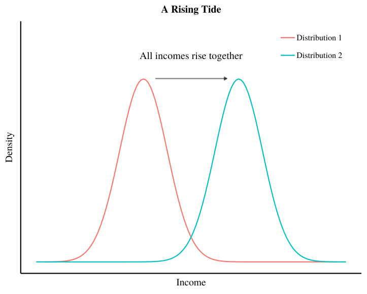
There are two basic ways that a distribution can change. First, a distribution can shift left or right while keeping its shape unchanged. To help you understand this change, I’ll call it the the ‘rising tide’ (that lifts all boats). Second, a distribution can change shape. Here I’ll focus on a transformation in which the distribution tail gets fatter. I’ll call this the ‘rich getting richer’.
The ‘rising tide’ and the ‘rich getting richer’ have very different consequences. Let’s use income to illustrate the differences. The figure below shows an example of the rising tide. We imagine a distribution of income that, over time, shifts to the right. This means that everyone’s income gets larger together. Since the distribution shape remains unchanged, income inequality also remains unchanged.
Now let’s illustrate the rich getting richer. In this scenario, the income of most individuals does not grow. Instead, the rich pull away from the poor. As a consequence, the distribution tail gets fatter and inequality increases. The figure below shows this transformation:
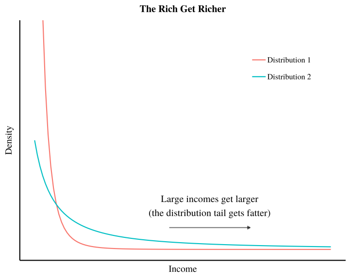
Both the ‘rising tide’ and the ‘rich getting richer’ can lead to an increase in average income. But this increase is achieved in very different ways. In the ‘rising tide’, everyone’s income grows together. But when the ‘rich get richer’, all the gains are monopolized by the rich. The poor don’t see a dime.
Armed with these two metaphors for changing distributions, let’s return to the size distribution of firms. In Groping in the Dark, I showed that average firm size increases with energy use. If you’re like me, you intuitively think a growing average indicates a ‘rising tide’. You envision all firms getting larger together. But it turns out that this is not what happens. The change in firm size with energy use is a ‘rich getting richer’ process. As energy use increases, the size of most firms remains unchanged. Instead, a small number of large firms get larger still. As a result, employment becomes increasingly concentrated in large firms. Let’s look at this transformation in action.
Energy and firm size: big firms get bigger
To look at the transformation of the size distribution of firms, we’re going to use international data. We’re going to aggregate firm data within groups of countries. This aggregation allows us to get a large sample of firms — something that is essential for studying power-law distributions.
In the figure below, I rank countries by energy use and then put them into 5 equally-sized groups (5 quintiles by energy use). Within each group of countries, I plot the aggregate size distribution of firms. I use a log-log scale, which means that equally-spaced tick marks indicate growth by powers of 10 (on both axes). The inset plot shows the average energy use per capita of each group of countries.

To interpret these results, let’s review some features of power-law distributions. When the histogram of a power law is plotted on a log-log scale, it appears as straight line. The slope of this line relates to the exponent of the power law ( {\alpha} ). A shallower slope indicates a smaller exponent.
Looking at the figure above, we see two things. First, our histograms are roughly straight lines. This means that the size distribution of firms roughly follows a power law. Second, as energy use increases, the slope of the firm size distribution gets shallower. Or put another way, the tail of the firm size distribution gets fatter. Here is our ‘rich getting richer’ process in action. As energy use increases, large firms get larger, while most small firms stay the same size.
What is remarkable about this transformation is that we can reduce it to a single number. As energy use increases, the exponent of the firm size distribution gets smaller. Between our five groups of countries, the relation looks like this:

Are you surprised by the above relation? I am — even after years of knowing about its existence. It is astounding that we can reduce (albeit roughly) a complex social transformation to a single number. On the face of it, there is no reason that we should be able to do this. Think of the immense changes that come with industrialization: we adopt new technologies, we move to cities, we consume more resources, we specialize in different occupations, etc. Why should any of this change reduce to a single parameter? And yet with firm size, it does. We can reduce the transformation of the firm size distribution to a change in power-law exponent. Moreover, this parameter is function of energy use. A social scientist could not ask for a simpler result!
This simple result begs for a simple explanation. Unfortunately, I haven’t found this simple explanation yet (at least not one that I am satisfied with). But I’m pretty sure that the growth of firm size has to do with hierarchy. We’ll look at the growth of hierarchy in future posts. But for now, I want to give you an intuitive sense for how the size distribution of firms changes with energy use.
Visualizing the changing size distribution of firms
To aid your (and my) intuition, I’ve spent the last few weeks doing some tedious coding. But the results are (I hope) worth it. I’ve created two animations that visualize how the size distribution of firms changes with energy use. I think these animations give you a better sense for what is going on than fixed images alone. If I had my act together, these videos would have audio narration that tells you what’s going on. But I haven’t had the time to add audio (I blame the fact that writing this blog is not my day job). So unfortunately, you’re stuck with a text description. C’est la vie.
The fattening tail of the firm size distribution
We’re going to start by looking at histograms. In the video below, I take a power-law distribution of firms and then decrease the power-law exponent ( \alpha ) over time. I show you how this changes the firm size histogram. The top left panel in the video shows the changing histogram on a linear scale. The bottom left panel shows the changing histogram on a log-log scale.
My goal in this animation is to show you how the changing power-law exponent can unify the stylized facts discussed in Groping in the Dark. Let’s start with self-employment. As energy use increases, self employment rates decline. On our histogram, self employment rates are represented by the red shaded region in the upper left panel. I’ve assumed that every firm with 2 or fewer members is a ‘self-employer’ firm. The top right panel shows the self-employment rate. Let the video play and see how a decreasing power-law exponent causes self-employment rates to plummet.
Next let’s look at average firm size, which tends to increase with energy use. In the top left panel of the video, I’ve indicated average firm size with a vertical line. As the firm power-law exponent decreases, average firm size increases. This process is non-linear, however. Average firm size grows more rapidly as the power-law exponent approaches 2. In the video, I slow the decrease in \alpha with time so you can better see what’s going on.
Lastly, let’s look at the employment share of large firms. In this animation, I define ‘large firms’ as having more than 5000 employees. The blue shaded region in the bottom left panel indicates the employment of these large firms. The bottom right panel shows their share of employment. Play the video and watch how employment gets concentrated in these large firms.
The changing firm landscape
If you’re like me, you find histograms beautiful but a little too abstract. Histograms don’t give me a visceral feeling for the ‘rich getting richer’ process. To get this visceral feeling, I need to visualize individual observations — in this case individual firms.
I’ve come up with a way of visualizing individual firms that I call the ‘firm landscape’. In this landscape, firms appear as pyramids. The size (volume) of the pyramid indicates the number of employees within the firm. The firm landscape allows us to get a sense for the power-law distribution of size.
The video below uses the firm landscape to visualize how the size distribution of firms changes as energy use increases. You’ll see a succession of different firm landscapes, starting from very low energy use (hunter-gatherer levels). With each new landscape, energy use per capita increases. You get to see how this relates to the changing size distribution of firms.
I create each landscape by sampling from a (discrete) power-law distribution. At the top of each landscape, I show the power-law exponent ( \alpha ) used in the simulation. I also show average firm size and the predicted level of energy use per capita. For the methods used to predict energy use, see my recent paper Energy, hierarchy and the origin of inequality. To give a sense of the type of society you’re viewing, I show the country that best matches the energy use of the simulated society.
This video nicely illustrate the ‘rich getting richer’ process — which in this case is large firms getting larger. Here’s how I recommend you watch the animation. The first time through, your eyes will naturally be drawn to the growth of large firms. As the video plays, each new landscape brings larger and larger pyramids. This is the natural focal point of the animation — larger firms getting larger. But it is only half the process.
The other half of the process is the unchanging sea of small firms. The second time through the video, try to focus on this sea. Choose a patch of landscape and look at the tiny dots. These dots are small firms. If you keep your focus, you’ll find that this sea of small firms doesn’t change much. Small firms remain the same, while progressively larger pyramids emerge in their midst. In other words, there is no rising tide of firm size.
Simplicity and Significance
I stated at the outset of this post that I hoped to impress you with both the simplicity and the significance of the firm-size transformation. The simplicity is that the changing size distribution of firms can be modelled by a single number — the power-law exponent. Moreover, this single number is itself a simple function of energy use. That we can achieve this reduction still boggles my mind.
The significance of this transformation is (I hope) implicit in the firm landscape animation. The growth of large firms has to be one of the most monumental transformations in human history. I’m not exaggerating when I say that it ranks with the emergence of agriculture and the transition to fossil fuels. In modern industrial societies, large firms dominate our lives. To name just two firms, think of the influence that Walmart and Amazon have on our society. It behooves us to understand why these huge firms exist.
Given levels of energy use, I’ve illustrated a formula that can predict the existence of large firms. But this formula doesn’t tell us why these large firms exist, or why they grow as energy use increases. Answering this ‘why’ question is a difficult task. I think the growth of large firms is about hierarchy. But that’s a topic for future posts.
Support this blog
Economics from the Top Down is where I share my ideas for how to create a better economics. If you liked this post, please consider becoming a patron. You’ll help me continue my research, and continue to share it with readers like you.

Stay updated
Sign up to get email updates from this blog.

This work is licensed under a Creative Commons Attribution 4.0 License. You can use/share it anyway you want, provided you attribute it to me (Blair Fix) and link to Economics from the Top Down.
A Case of Kapital Equipment Manufacturing and Customer Kapital Usage*:
1. Only larger firms can make cars or complicated Kapital equipment. Two person shops do not make jet planes.
2. The customers use energy for a about a decade when they use the cars, Kapital.
3. With using time saving capital more people have more time available to work.
4. The more complicated things are, the more people that are involved in designing and making them counteracted by automation. But, automation requires people to program, and service. And that automation often takes power and are manufactured.
5. A manufature of complicated items can export more complicated items to a less complicated economiy. And visa versa. But, it is hard for a simpler economy to export those items.
6. Long lasting productive capital can command a price that is a capitalizeation of its output.rate over its life.
Also, power per capita or energy per capita per year is a number that indicates power avilability such as electrification or number of autos. If you do not have autos you do not have acess to the power for transportation even if you can buy the fuel.
*”But this formula doesn’t tell us why these large firms exist, or why they grow as energy use increases. Answering this ‘why’ question is a difficult task. I think the growth of large firms is about hierarchy. But that’s a topic for future posts. “
Quite an impresive result.
It looks like the cross over point is at about 1.9 persons for firm size. Above about 1.9 persons/firm the number firms sized greater than 1.9 persons per firm increase with power usage, GJ/year/person. Below about 1.9 persons/firm perhaps the number of firms decrease with increasing power usage per capita per year.
[…] Energy and the Size Distribution of Firms, I showed that the size distribution of firms follows a power law. I also showed that the exponent […]
[…] Energy and the Size Distribution of Firms, I showed that the size distribution of firms follows a power law. I also showed that the exponent […]
[…] The probability of finding a firm of size x is roughly proportional to the inverse square of x (see this post for more details). This means that Bob’s firm, which is twice as large, is about 4 times […]
[…] abundance of firms declines with size. Small firms are abundant. Large firms are rare. I’ve studied this phenomenon for years. But until recently, I’d never asked an important question: where do governments […]
[…] you’re a regular reader, you’ll have seen much of this material before (here, here, here, and here). But perhaps you’ll enjoy an audiovisual presentation of it. If you’re a new […]
[…] Energy and the Size Distribution of Firms, I showed that the size distribution of firms follows a power law. I also showed that the exponent […]
[…] The probability of finding a firm of size x is roughly proportional to the inverse square of x (see this post for more details). This means that Bob’s firm, which is twice as large, is about 4 times […]